By GWOPNovember 24, 2013GWOP Leave a comment Anatomy of a Top Performing CEO 
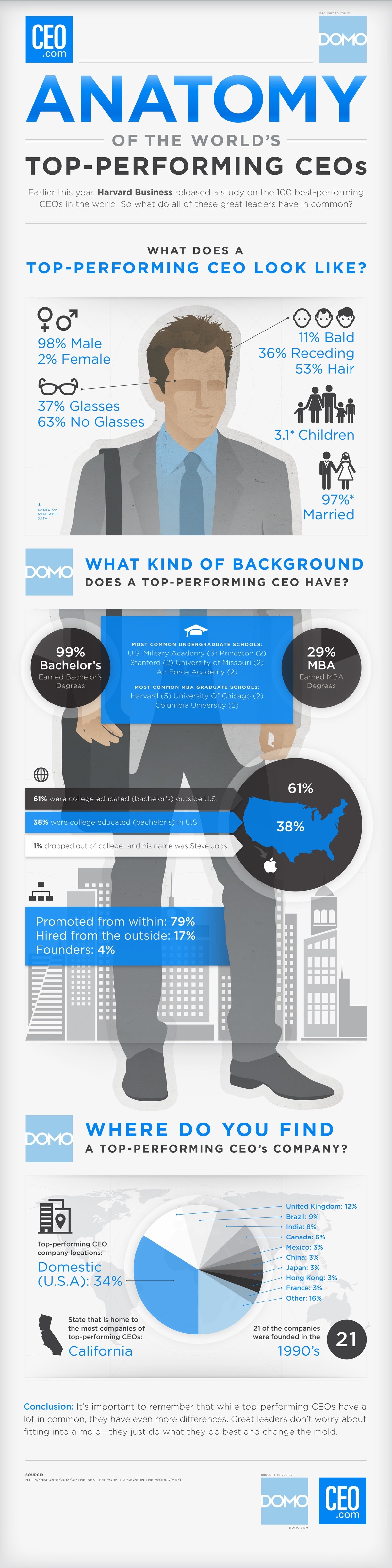
Data compiled by the Harvard Business Review, Domo and CEO.com created an infographic to show us what a top-performing CEO looks like. Share #GWOP: Click to share on Flattr (Opens in new window) Flattr Click to share on Pinterest (Opens in new window) Pinterest Click to share on LinkedIn (Opens in new window) LinkedIn Click to share on Tumblr (Opens in new window) Tumblr Click to email a link to a friend (Opens in new window) Email Click to share on X (Opens in new window) X Click to share on Reddit (Opens in new window) Reddit Click to share on Facebook (Opens in new window) Facebook Click to print (Opens in new window) Print Click to share on WhatsApp (Opens in new window) WhatsApp Like Loading... Related 2013anatomybusinessCEO